
Weekend Reads
Reads:
- As Good as I've Seen
- The Data Has Spoken - Buy Stocks
- Weekly Market Summary
- When Will It Be Time To Sell?
- Crumbling?
- Most Important Chart
- The Last 4,195 Times this Happened the Market Rallied
News:
Tweet of the morning:
RT @Vallmeister: This is terrifying pic.twitter.com/urmOMSAXyY
— Scott Galloway (@profgalloway) April 29, 2018
Open Interest Changes:
[Check Back Monday Morning]
Unusual Option Action from Fridays Session:

Charts:
Premium:
Earnings:
SeekingAlpha: Week Ahead (link)
Earnings season is in full swing.
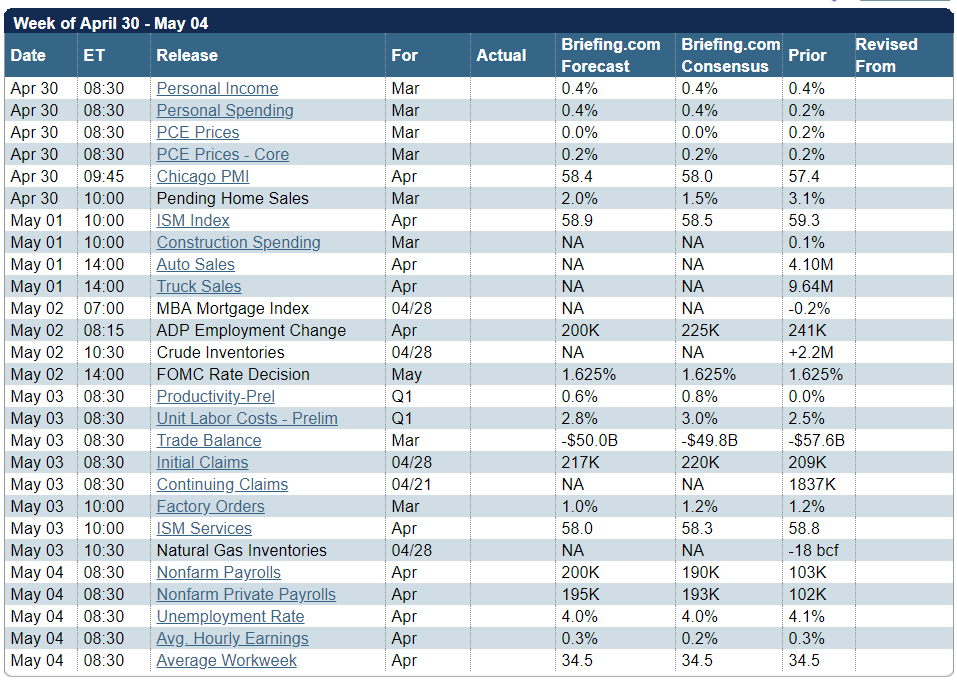
Briefing.com has a good U.S. economic calendar for the week (and many other good features which I monitor each day). Here are the main U.S. releases.
Next Week’s Theme
While few expect the FOMC to increase rates at this meeting, attention will focus on the statement accompanying the decision. Many of this week’s reports will be released after the Fed’s Wednesday meeting, but we can expect them to be interpreted with Fed policy in mind. I expect pundits and financial writers to be asking:
Will strong economic data drive interest rates higher?
The question actually has several parts.
- Will the data show strength?
- What change might the Fed make? Most expect no rate change this week, but there is a growing chance of four rate hikes this year.
- Would such a change affect the long end of the interest rate curve? The slope?
- Schwab doesn’t think so. They also include several of my frequently-made points about volatility and include several points about continuing economic strength.
-
- James Picerno takes a balanced look.
- Could the economic data increase anticipated inflation?
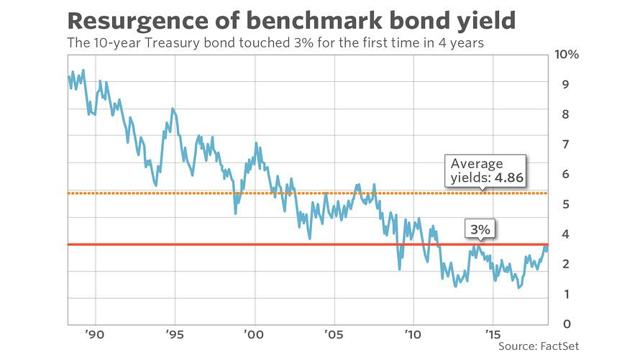
- Would a move past the psychological 3% rate on the ten-year note be significant? Some technicians and traders think so, but those using data have reached a very different conclusion.
- MarketWatch states the various viewpoints.
-
- Scott Grannis sees no overall economic effect and little effect on the number of new home mortgages.
…it is rising demand for loans and a stronger economy which are bidding up the cost of borrowed money. The higher rates of the past year or two are not bad for growth because they are the natural result of stronger growth. Higher rates are only bad when they rise in real terms as a result of tighter monetary policy, but that's not the case today.
-
- Morningstar cites 3% as an historically “attractive level for more cautious investors.”
- Scott Rothbort does the math on the concept of bond “safety.”
Let’s say that you buy a 10-Year US Treasury Bond yielding 3% right now. Should you hold that bond to maturity you would indeed receive a 3% annual yield to maturity. However, let’s say that in three years hence, interest rates continue to rise, such that the yield on a 7-year US Treasury would rise to 4%. That is certainly plausible. Should that happen your bond with seven years remaining to maturity would now be valued at (I am rounding) 94 cents on the dollar. You would have lost 6% on your bond, less three years of 3% coupons, resulting in a net gain of 3% in three years’ time. If you factor in inflation, which is currently running at 2.5%, you would have a real loss on your bond investment.
A jump in rates to just 4.5% would, in three years’ time, value that bond at 91 cents on the dollar. The greater the rise in rates, the greater the bond loss. As you can see, you can lose money in bonds
As usual, I’ll save my personal conclusions and suggestions for today’s Final Thought.
Quant Corner
We follow some regular featured sources and the best other quant news from the week.
Risk Analysis
I have a rule for my investment clients. Think first about your risk. Only then should you consider possible rewards. I monitor many quantitative reports and highlight the best methods in this weekly update.
The Indicator Snapshot
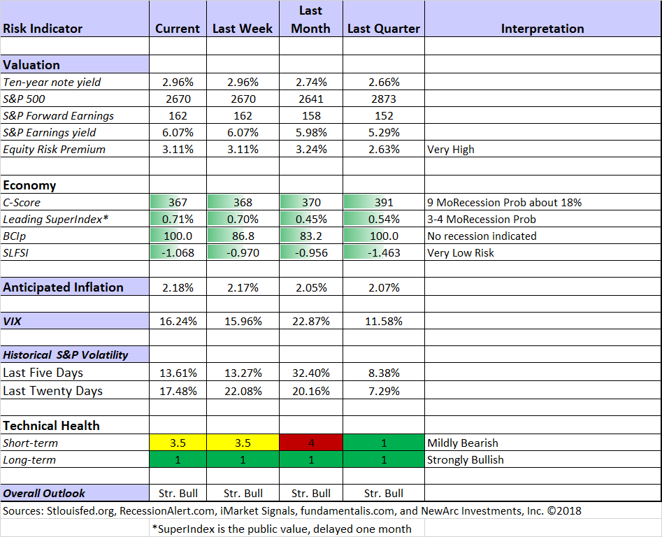
Short-term trading conditions remain in the neutral zone. We continue to monitor the technical health measures on a daily basis. The trading indicator did not drop low enough to take us out of the market in trading programs, but it was close. The long-term fundamentals and outlook are little changed. The long-term technical health is back to strongly bullish.
The Featured Sources:
Bob Dieli: Business cycle analysis via the “C Score.
RecessionAlert: Strong quantitative indicators for both economic and market analysis.
Brian Gilmartin: All things earnings, for the overall market as well as many individual companies.
Georg Vrba: Business cycle indicator and market timing tools. None of Georg’s indicators signal recession.
Doug Short and Jill Mislinski: Regular updating of an array of indicators. Great charts and analysis.
Guests:
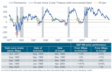
“Davidson” (via Todd Sullivan) provides several charts suggesting 12+ months of further expansion. He also notes that the yield curve remains far from the level where we might start worrying. Here are some examples of his indicators.

Insight for Traders
Check out our weekly Stock Exchange post. We combine links to important posts about trading, themes of current interest, and ideas from our trading models. This week we had some fun, featuring a bogus and ominous chart formation. As usual, we discussed some stock ideas and updated the ratings lists for Felix and Oscar, this week featuring the DJIA stocks. Blue Harbingerhas taken the lead role on this post, using information both from me and from the models. He is doing a great job, presenting a wealth of new ideas and information each week.
While I emphasize trading in the Stock Exchange series, it often has implications for long-term investors. I recommend a visit to check it out.
Insight for Investors
Investors should have a long-term horizon. They can often exploit trading volatility! I remind investors of this each week, but now is the time to pay attention.
Best of the Week
If I had to pick a single most important source for investors to read this week it would be John Rekenthaler’s (Morningstar) attack on the overuse of “bubble” with special attention to a recent report from Research Affiliates. He notes that the report treats the idea of over-valuation as self-evident, and a preface for analysis of global technology stocks.
Perhaps, but it certainly reflects the common perception in financial media. Rekenthaler writes:
I don't see a bubble--certainly not with the overall U.S. stock market. With a forward earnings yield of 6% (earnings yield being the inverse of a P/E ratio: earnings divided by price), at a time when 10-year Treasuries pay 3% and annual inflation hovers around 1%-3%, stocks are not dear when compared with the alternatives. At some point, of course, the economy will turn; those P/E ratios will spike because earnings collapse; and stocks will get shellacked. But the same could have been written in 2012, and 2013, and so forth. Without further evidence, why believe this year is different?
And later…
Many bubbles are proclaimed, but few arrive. The word is not useful; rather than signal something extraordinary, it has come to mean "securities I don't like because they strike me as being too expensive."
Stock Ideas
Chuck Carnevale concludes his five-part series on fifty dividend growth stocks. With his customary attention to measuring value and discussing methods, readers get a great lesson as well as some stock ideas.
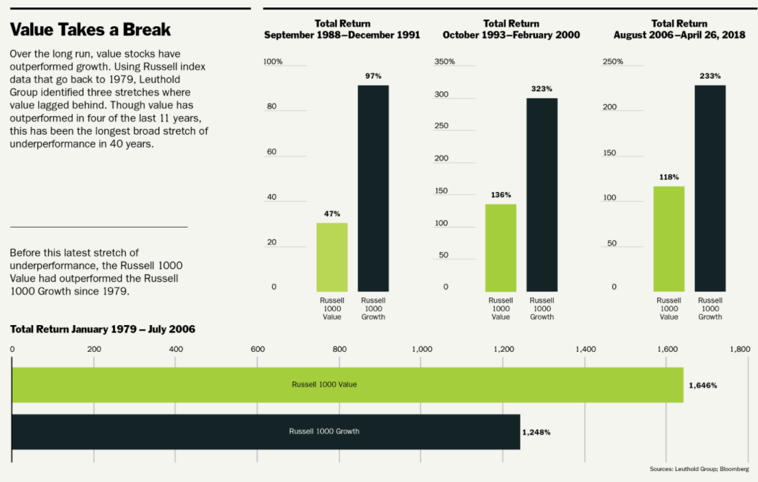
Time for value stocks? Barron’s, in the cover story, analyzes the recent lag versus growth stocks, and what might change.
Jason Zweig (WSJ) takes up the same question, doing some valuation comparisons.
New homes. Hot because there is not much choice according to Veritas Urbis Economics LLC (Bloomberg).
GE or Netflix? Peter F. Way uses his market maker data to reach a decision geared to near-term capital gains.
Netflix? Aswath Damodaran’s thorough analysis is what we would expect from the leading valuation expert. He examines the history of the company, each element of business value, and sums the parts. Setting a great example for others, he also shares the underlying data, so that others can take a closer look. Read the full post for his conclusion – and for your own education in methods. Hint: He is not an enthusiast. Compare the result with the Morningstar analysis below.
From the Sohn Conference:
Larry Robbins talks healthcare names, asserting that AMZN will not “swallow up the industry” and is unlikely to get into PBM.
The Sohn contest winner, Andrew Walker of Rangeley Capital, blogs about his experience, the thesis behind his submission of La Quinta (NYSE:LQ), and his supporting slides.
Personal Finance
Seeking Alpha Senior Editor Gil Weinreich has expanded his excellent series for financial advisors (and serious individual investors) to include some podcasts. This week I especially enjoyed his post, 2 Conservative Approaches to Retirement. One of these is a zero-risk approach to stock investing from Prof. Laurence Kotlikoff. Read the entire post to see his interesting idea, geared to having a steady floor for spending. I have not yet evaluated the software, but it seems to involve choosing a conservative level of spending geared to your assets.
Alicia Adamczyk provides a good summary of how various types of retirement income are taxed (two cents).
Abnormal Returns is always worth reading, with many links on an array of interesting topics. Wednesday the focus is on personal finance. There always several good choices. My favorite this week was a warning to prospective retirees: Beware of unreality in estimating spending. The WSJ analyzes the key issues.
Also worth a look is the Financial Suamurai’s comparison of owning stocks versus real estate.
Watch out for…
4 extremely overpriced stocks (Morningstar). Netflix (NASDAQ:NFLX) is deemed to be trading for 3.4 times their fair value estimate.
Bitcoin. “The greatest scam in history” asserts Bill Harris, former CEO of Intuit and founding CEO of PayPal and Personal Capital (Recode). Did you know there were now over 1500 cryptocurrencies representing $300 billion of value?
Final Thoughts
I expect continuing economic strength in this week’s data. Bob Dieli warns that you should use your indicators, not guess how they will change. Some are citing sources that compare results to expectations, but we must keep in mind that the expectations have been very strong.
I cannot predict the exact course of Fed policy, and I really do not care. Stock prices reflect earnings growth, economic growth, and expectations for more of the same. The Fed gets credit for providing some economic stimulus and will deserve blame if it errs in the pace of stimulus removal. As long as the pace of rate increases matches growing economic strength, the Fed is not a valid source of worry. It will, however, continue as the favorite bogeyman for the punditry.
The yield curve reflects the Fed on the short end and inflation expectations on the long end. The two are related of course. Ten-year rates rising above 3% do not represent a problem for stocks.
Will inflation anticipation increase? This indicator has been creeping higher, as you can see from the indicator snapshot. Strong data will push it further.
To summarize, the economy reflects solid growth and earnings have been even stronger than the high expectations. Despite these factors stock prices have corrected.
Potential investors now have both lower prices, stronger earnings, and reduced risk.
Whether you are trying to preserve wealth or to build your assets, there are some great opportunities right now. If you are having trouble pulling the trigger, organizing your thoughts, or finding attractive stocks, send a note to main at newarc dot com. We will send some free resources and provide a consultation if you wish.
I’m more worried about:
- Iran. The deadline for US withdrawal from the agreement is nearing. There are no signs of progress. There will be additional time before new sanctions are imposed, but it has moved up my worry list.
- Deterioration in the tariff and trade talks. This is the most sensitive issue for the market, and it remains a rhetorical playground for world leaders.
I’m less worried about:
- North Korea. Last week’s official end to the Korean War is an encouraging step. While many remain skeptical (The Economist) about the substance and the potential for the Trump summit, you must start somewhere.
- Global economy. Setting aside those who see good news only as a precursor to disaster, most observers have taken note of an improving picture. Growth is higher and recession odds are lower.
Chart Solutions from Above
A key question is whether your chart is designed to make an argument or to present data. The colors, terminology, and extension of the future debt levels are the marks of a man on a mission. Technically –
- Any chart of debt that does not compare with assets or ability to pay is telling only half of the story.
- No inflation adjustment.
- The left scale covers a brief time, does not start at zero, and does not use a log scale. It results in an exaggeration of the growth in debt.
- The debt ceiling labels are deceptive. Most would infer that the debt ceiling was doing something positive. In fact, it forced a variety of extraordinary measure and delays in spending that had already been authorized. We should expect a burst of spending when that period ends.
The MarketWatch version really emphasizes the need for a log scale. Looking at time intervals for a fixed increase of $1 trillion is deceptive. Why not look at the time interval for the debt to double in real terms.
As I have written, the US and the world have a debt problem. This kind of analysis does not advance the case for those seeking objectivity and sound solutions.